
Table of Contents
Your product is exceptional. Your photography is… not.
The difference between a product that looks like a ₹500 item and one that looks like it costs ₹50,000? Nine times out of ten, it’s lighting.
In the hyper-competitive world of e-commerce and brand marketing in 2026, product photography isn’t just about showing what you sell—it’s about communicating value, quality, and desirability before customers ever hold your product in their hands. Over 75% of online shoppers consider product images as the most important factor in their purchasing decisions, yet most brands fundamentally misunderstand the single most powerful variable in product photography: light.
Great lighting doesn’t just illuminate products—it transforms them. It creates the subtle gradations on a luxury watch that communicate precision engineering. It produces the soft glow on cosmetics that suggests luxurious texture. It generates the dramatic shadows on electronics that convey innovation and sophistication.
At Cybertize Media Productions Private Limited, we’ve photographed everything from ₹200 consumer goods to ₹2 crore jewelry pieces. The techniques that make products look premium aren’t secret—but they are specific, systematic, and surprising to brands who assume “good lighting” simply means “bright and even.”
Top Cybertize Offerings
Our comprehensive Media & Tech Services in India offerings include:
| Service Category | Specific Services |
|---|---|
| Film Production | Film, Web Series, Short films, Cinematic Films, IG Reels, Ad Films |
| Animation Production | 2D animation, 3D animation, Walkthrough, Medical Animation, Explainer Videos |
| Software Development | CMS (Content Management Softwares), On Demand Software, Edtech, SaaS Portals, ERPs, Cloud Infra, AWS, Azure |
| SEO & Content Marketing | Blog writing, video production, infographics, email marketing, white papers, case studies, On Page SEO, Link Building |
| Web Development | Website design, responsive development, e-commerce, CMS implementation, site optimization |
| AI / ML | Artificial Intelligence / Machine Learning |
This comprehensive guide reveals the professional lighting strategies that separate amateur product photography from premium imagery that drives conversion, commands attention, and justifies price points. From understanding the science of how materials interact with light to mastering specific setups for different product categories, you’ll learn the exact techniques we use to make products look exponentially more valuable than their competitors.
The Psychology of Premium: How Lighting Communicates Value
Before diving into technical setups, understanding why certain lighting communicates luxury is essential. Premium perception isn’t accidental—it’s the result of specific visual cues that lighting either creates or destroys.
Lighting Techniques That Make Products Look Premium: The Gradation Principle: Luxury Lives in Subtlety
Amateur product photography tends toward flat, even illumination—every surface receiving equal light. Professional premium photography does the opposite: it creates gradations—smooth, subtle transitions from light to shadow that communicate dimensionality, quality, and craftsmanship.
Bare bulbs create the fastest possible gradations that are essential in watches photography, jewelry photography and in commercial product photography in general. These gradations are what separate luxury items from mass market photography.
Why Gradations Signal Premium Quality:
- Dimensional Depth: Flat lighting makes products look two-dimensional. Gradations create the sense of three-dimensional form that suggests substance and quality.
- Material Sophistication: Premium materials (metals, leather, glass) have characteristic ways light moves across their surfaces. Gradations reveal these material properties.
- Craftsmanship Communication: Subtle lighting shows detail, texture, and finish quality that flat lighting obliterates.
- Visual Interest: Gradations create visual complexity that holds attention longer—critical in scroll-heavy e-commerce environments.
Real-World Example: Compare two watch photographs—one lit evenly from the front (flat, boring, cheap-looking) versus one lit with carefully controlled gradations showing polished surfaces transitioning from bright highlight to subtle shadow. The second immediately reads as more expensive, even if it’s the same ₹5,000 watch.
Contrast Control: The Premium Balance
Luxury photography walks a precise line between too little contrast (flat, dull) and too much contrast (harsh, aggressive). The fill light is crucial in providing detail in the shadow areas without overpowering the main light, ensuring a natural-looking result.
The Premium Contrast Formula:
- Highlights: Should have detail, not blown-out white
- Shadows: Should have depth, not be pure black
- Midtones: Should have nuance and gradation
- Overall: Should feel balanced, not extreme
Color Temperature and Material Reality
Premium photography maintains accurate color representation while using color temperature strategically. Most products look best under 5600K (daylight-balanced) lighting. Matching all your studio lights to the same color temperature avoids odd color casts and ensures your images are true to life.
Color Temperature Strategy:
- Neutral/Cool (5000-6500K): Tech products, modern luxury, clinical precision
- Warm (3000-4500K): Heritage brands, comfort goods, artisanal products
- Mixed: Intentional color contrasts for creative effects
The key: color must feel intentional, not accidental. Mismatched color temperatures look amateur.
Material-Specific Lighting Strategies
Lighting Techniques That Make Products Look Premium: Different materials demand fundamentally different lighting approaches. What works for matte surfaces destroys metallic ones. What flatters fabric ruins glass.
Reflective Metals: The Gradation Challenge
Polished metal—watches, jewelry, electronics—represents product photography’s greatest lighting challenge. Metal surfaces act as mirrors, reflecting everything around them.
The Core Problem: Direct light on metal creates hot spots (blown-out reflections) that look terrible. Yet too little light makes metal look dull and cheap.
The Professional Solution: Indirect Lighting Through Large Diffusion
Instead of lighting the product directly, you light large diffusion panels that the metal then reflects. Metallic surfaces need diffused lighting to prevent hot spots while maintaining shine.
Setup for Reflective Metals:
- Primary Diffusion: Large softbox or diffusion panel positioned to side of product (45-90 degrees)
- Secondary Fill: Opposite side with white reflector or low-intensity softbox
- Rim Light: Small light source behind product creating edge definition
- Black Cards: Strategically placed dark materials creating dark reflections that define edges
Specific Positioning:
- Main light 45 degrees from product axis
- 2-3 feet away minimum (larger diffusion = softer reflection)
- Height adjusted so reflection appears in upper third of product
- Black cards close to product on sides not receiving direct light
Watch Photography Specific Technique: Positioning the bare bulb behind acrylic diffusion is very crucial and very time-consuming. The smaller a shiny object, the more important this technique becomes. For luxury timepieces, this precision creates the characteristic gradations that separate premium from amateur photography.
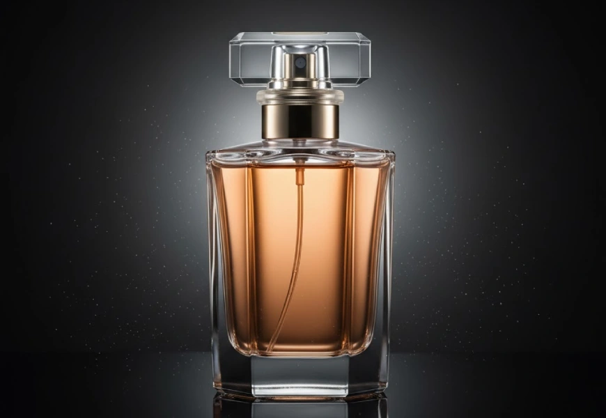
Transparent Materials: Glass, Acrylic, and Liquids
Transparent products (perfume bottles, glassware, beverages) require completely different strategy focused on edge definition and internal glow.
The Core Challenge: Transparent objects disappear against backgrounds without proper lighting. They need light both through them and around them.
The Professional Solution: Backlighting Plus Edge Lighting
Setup for Transparent Products:
- Primary Backlight: Large light source behind and slightly below product
- Edge Lights: Strip lights or small sources on each side creating rim definition
- Fill: Subtle front fill to add dimensionality without overwhelming backlight
- Dark Background: Often black background allows transparency to show while edges define form
Positioning Specifics:
- Backlight centered behind product, aimed upward through it
- Edge lights at 45-degree angles from product sides
- Front fill very low power (1/4 to 1/8 backlight intensity)
- Black background 2-3 feet behind product to avoid light spill
Liquid Products Technique: For beverages or liquid-filled bottles:
- Backlight creates internal glow and color saturation
- Side lights define container shape
- Top light can create surface reflections on liquid
- Colored gels on backlights enhance or modify liquid color
Advanced Technique: Gradient Lighting for Depth: Use multiple backlights at different intensities creating light gradient through transparent object, adding visual interest and dimensionality.
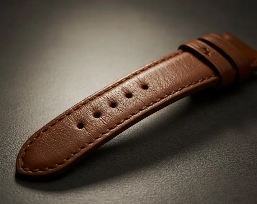
Matte and Textured Surfaces: Revealing Detail
Matte products (leather, fabric, unfinished wood, matte-finish electronics) need directional lighting to reveal surface texture.
The Core Challenge: Even, flat lighting makes texture disappear. Texture requires shadow to be visible.
The Professional Solution: Strong Directional with Controlled Fill
Setup for Textured Products:
- Key Light: Hard or moderately soft source at 30-45 degree angle
- Fill Light: Soft, low-intensity fill on opposite side (ratio 2:1 or 3:1)
- Back/Rim Light: Optional edge definition
- Positioning: Angle creates micro-shadows revealing texture
Leather Products Specific:
- Side lighting at 45 degrees emphasizes grain
- Slightly harder light than for smooth materials
- Fill light keeps shadows from going too dark
- Warm color temperature (3500-4500K) complements leather tones
Fabric Products:
- Slightly more diffused than leather
- Higher angle (60-70 degrees) can emphasize weave
- White or light background typically preferred
- Careful exposure to prevent fabric looking muddy
Dark Products: The Detail Revelation Challenge | Lighting Techniques That Make Products Look Premium
Black or very dark products (dark electronics, black leather, dark bottles) present unique challenges—they absorb light, making detail disappear.
The Core Problem: Insufficient lighting makes dark products look like black blobs. Too much light makes them look gray rather than black.
The Professional Solution: Edge Lighting Plus Controlled Fill
Setup for Dark Products:
- Edge/Rim Lights: Strong lights creating bright edges defining form
- Fill Ratio: Higher fill light ratio (2:1 minimum) to reveal surface details
- Reflectors: Strategic white reflectors bouncing subtle light into dark areas
- Black Background: Often necessary to maintain darkness while showing detail
Dark products often require fill lights at 2:1 ratio to reveal details without washing out.
Positioning for Dark Products:
- Primary edge light behind and to side (70-90 degrees from camera)
- Secondary edge light opposite side
- Front fill low and diffused (just enough to show texture)
- Careful metering—expose for highlights, let shadows stay dark
Black Leather Specific:
- Even harder edge lighting than regular leather
- Very subtle texture light from 30-degree angle
- Glossy black leather treated more like metal (reflective surfaces)
- Matte black leather needs texture reveal
The Three-Point Premium Lighting System
Professional product photography typically builds on the classic three-point lighting system, adapted for products rather than portraits.
Understanding the Three Lights
Key Light: The key light is the primary light source positioned at a specific angle to the subject, illuminating the primary areas of interest, creating the main highlights and shadows.
Fill Light: Positioned on the opposite side of the key light, the fill light is less intense. Its job is to “fill in” the shadows created by the key light, reducing overall contrast and revealing more detail in the darker areas.
Back Light: This light is placed behind the product, often pointing towards the back of the product or the camera. It creates a subtle, bright outline around the product’s edge, separating it from the background and adding a sense of depth and professionalism.
Adapting Three-Point for Products
Standard E-commerce Setup:
Key Light Position:
- 45 degrees to product’s right or left
- 30-45 degrees above product
- Large softbox (24″x36″ minimum) for soft gradations
- Power: Full intensity (adjust camera settings for exposure)
Fill Light Position:
- Opposite side from key light
- Same height or slightly lower
- Can be reflector instead of powered light (more budget-friendly)
- Power: 1/2 to 1/3 of key light intensity
Back Light Position:
- Behind product, aimed toward camera (carefully avoiding lens flare)
- Slightly higher than product
- Strip light or small source for defined edge
- Power: Equal to or slightly less than key light
Practical Example: Electronics Product:
- Key light (right, 45 degrees): Creates main form and shadows
- Fill light (left, reflector): Reveals detail in shadows without eliminating them
- Back light (behind, top): Creates separation from background
Result: Three-dimensional, professional look with clear form definition.
Premium Variation: The Five-Light Luxury Setup
Lighting Techniques That Make Products Look Premium: For high-value products, professional studios often expand to five lights:
Fifth Light Options:
- Top Light: Creates highlights on top surfaces
- Second Back Light: Adds symmetrical edge definition
- Accent Light: Highlights specific product feature
- Background Light: Illuminates background separately from product
Budget-Conscious Premium Lighting Setups
Professional results don’t require professional budgets. Strategic equipment choices and technique knowledge produce premium imagery at accessible price points.
The ₹25,000 Starter Premium Setup
Equipment List:
- Two LED Continuous Lights (₹8,000-10,000):
- Godox SL-60W or similar
- Adjustable color temperature (3300-5600K)
- Dimmable for precise control
- Two Softboxes (₹3,000-4,000):
- One 60x90cm rectangular
- One 60x60cm square
- Include diffusion fabric and grid
- Light Stands (₹2,000-3,000):
- Two adjustable stands (2m minimum height)
- Stable, reliable construction
- Reflectors (₹1,500-2,000):
- 5-in-1 reflector kit (white, black, silver, gold, diffusion)
- Collapsible for storage
- Background (₹2,000-3,000):
- Seamless white paper roll or
- White acrylic sheet for reflections
- Modifiers (₹1,000-2,000):
- Black foam boards for negative fill
- Diffusion sheets for customization
- Clamps and stands for positioning
Total: ₹22,000-29,000
What This Achieves: Professional-quality lighting for 80% of product categories. Sufficient for e-commerce, social media, small catalog work.
The ₹10,000 Bare-Minimum Setup
Ultra-Budget Equipment:
- One LED Panel (₹4,000-5,000):
- Neewer 660 LED or similar
- Bi-color preferred
- DIY Softbox (₹1,000-1,500):
- Large cardboard box
- White fabric or paper diffusion
- Aluminum foil reflector inside
- Reflectors (₹800-1,200):
- White foam boards (₹300)
- Black foam boards (₹300)
- Aluminum foil on cardboard (₹200)
- Background (₹500-800):
- White poster board or fabric
- Stands/Clamps (₹700-1,000):
- DIY PVC pipe stands
- Spring clamps from hardware store
- Window Diffusion (₹500-800):
- Sheer white curtain fabric
- Mounting for window
Total: ₹7,500-10,300
Strategy: One good light + natural window light + reflectors = surprising quality
- Supplement LED with window light during day
- Use reflectors to multiply single light source
- Focus on proper positioning over equipment quantity
Natural Light Premium Setups (Nearly Free)
Window Light Professional Technique:
Equipment Needed:
- Large window with indirect light
- White foam boards (₹500-1,000)
- Black foam boards (₹300-500)
- Sheer white fabric for diffusion (₹500-800)
Setup:
- Position product table perpendicular to window (90 degrees)
- Place product 1-2 feet from window for soft light
- White reflector opposite window (fill light)
- Black foam board on non-lit sides (negative fill creating dimension)
- Sheer fabric over window if light too harsh
Best Times:
- Overcast days (natural softbox)
- North-facing windows (indirect light)
- 2 hours after sunrise or before sunset (soft angles)
Results: Surprisingly professional images indistinguishable from studio lighting in many cases. The key is control—understanding how to position and modify natural light.
Advanced Premium Techniques for Specific Product Categories
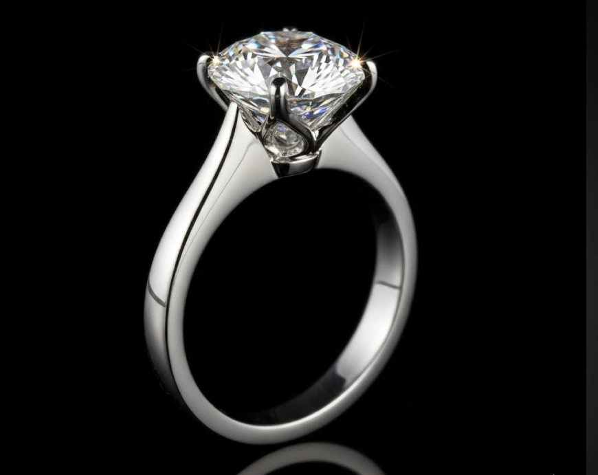
Jewellery: The Sparkle and Dimension Challenge
Jewellery photography demands simultaneous achievement of multiple goals: sparkle (light return from stones), form definition (metal gradations), and color accuracy (gemstone hues).
Professional Jewelry Lighting Setup:
For Diamonds and Clear Stones:
- Multiple small light sources creating “sparkle points”
- Overhead diffused key light (60-70 degrees)
- Side lights at 30-degree angles creating facet highlights
- Dark background to maximize contrast and sparkle
- Optional: Small mirror underneath creating additional light angles
For Coloured Gemstones:
- Softer, more diffused lighting than diamonds
- Backlight or transmitted light enhancing color saturation
- White or light gray background showing true color
- Careful color temperature control (5500-6000K for accuracy)
For Metal Settings:
- Large diffusion creating smooth gradations
- Black cards defining edges
- Polarising filters are especially useful when photographing pieces like watches or rings with large, polished surfaces, reducing reflections and enhancing color saturation
Complete Setup:
- Main softbox overhead (60-70 degrees, diffused)
- Two strip lights side angles (30 degrees each)
- Small light below (through diffusion) for under-illumination
- Black cards on three sides (defining edges through dark reflections)
- White or black background depending on jewelry type
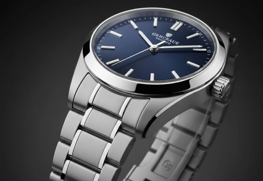
Watches: The Precision Luxury Standard
When photographing watches that retail for over $30,000, making the timepiece look like a luxury item becomes critically important.
Challenge: Watches combine every difficult lighting scenario—reflective metal, transparent crystal, small details, texture variation.
Professional Watch Lighting Approach:
Primary Setup:
- Main Gradation Light: Picolite or similar through acrylic diffusion panel
- Extension Light: Secondary light “extending” main light gradation to strap
- Fill Softbox: Small softbox opposite side, very low intensity
- Rim Definition: Small light or reflector behind watch
The small shadow below the object attaches it to the ground. The position of the acrylic plate is not very important but positioning the bare bulb behind it is very crucial and very time-consuming.
Specific Positioning:
- Acrylic diffusion 18-24″ from watch
- Bare bulb light behind acrylic (precise positioning critical)
- Watch at slight angle (not perfectly flat or upright)
- Multiple small reflectors and black cards fine-tuning reflections
- Often requires 30-60 minutes of micro-adjustments
Focus Stacking Requirement: Watches typically require focus stacking—multiple images at different focus points combined in post—to achieve sharpness throughout.
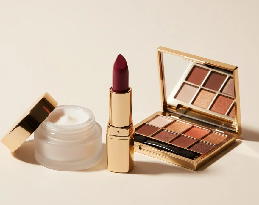
Cosmetics and Beauty Products: Soft, Flattering Luxury
Beauty products need lighting that suggests the same softness and luxury as the products promise.
Cosmetics Lighting Strategy:
For Packaging:
- Soft, diffused key light (large softbox)
- Minimal shadows (high fill ratio, 1.5:1)
- Often white or pastel backgrounds
- Clean, pure aesthetic
For Product in Use (creams, liquids visible):
- Backlighting creating glow through translucent products
- Soft key creating gentle highlights
- Very high-key (bright) overall feel
- Warm color temperature (4000-4500K) for skin-flattering quality
For Applicators/Tools:
- More dimensional lighting showing form
- Moderate contrast (2:1 fill ratio)
- Metallic applicators treated like jewelry
Food and Beverage: Appetite Appeal
Food photography lighting creates mood and appetite simultaneously.
Food Lighting Fundamentals:
Key Principles:
- Side lighting to emphasize texture and form
- Backlighting creating edge glow and steam visibility
- Warm color temperature (3500-4500K)
- Natural, not overly “perfect” aesthetic
Standard Food Setup:
- Key Light: Large softbox at 45-60 degrees (side/back)
- Fill: Reflector opposite (low ratio, minimal fill)
- Rim: Small light directly behind highlighting steam, edges
- Practical: Often includes candles or ambient for mood
For Beverages:
- Backlighting for transparency and liquid glow
- Ice cubes often replaced with acrylic (doesn’t melt)
- Condensation created with glycerin spray
- Small lights highlighting carbonation bubbles
Lighting Modifiers: The Professional’s Secret Weapons
Premium lighting isn’t just about lights—it’s about modifying light. Modifiers are what separate professional results from amateur attempts.
Softboxes: The Foundation
Softboxes are a staple for light in product photography, delivering soft, even illumination that’s ideal for reflective or textured products.
Types and Uses:
Rectangular Softboxes (60x90cm, 80x120cm):
- General product photography workhorse
- Creates rectangular reflection (natural, window-like)
- Versatile for most product types
- For product photos, square or rectangular soft boxes are your best bet, especially if photographing reflective objects. With this shape, reflections will be rectangular which looks most like a window
Square Softboxes (60x60cm):
- Even illumination all directions
- Good for products photographed from multiple angles
- Creates square reflections (less natural than rectangular)
Strip Softboxes (30x120cm, 35x160cm):
- Edge lighting and rim lights
- Creating linear gradations on cylindrical products
- Precise control over narrow light beam
Octoboxes (octagonal):
- Very soft, wraparound light
- Round reflections (sometimes preferred)
- Closer to natural light quality
Grids and Snoots: Precision Control
Honeycomb Grids:
- Attach to softboxes or reflectors
- Narrow light beam without hardening it
- Prevent light spill onto background
- Control gradation width
Snoots:
- Very narrow, focused beam
- Accent lighting on specific product areas
- Creating small, precise highlights
- Often used for rim lights
Reflectors and Bounce Cards
Types:
White Reflectors:
- Soft, natural fill light
- Brighten shadows without creating new shadows
- Most commonly used
Silver Reflectors:
- Stronger, more specular fill
- Creates brighter, harder-edged fill
- Use sparingly (can overpower)
Gold Reflectors:
- Warm-toned fill
- Rarely used in product photography
- Occasional use for warm, vintage aesthetics
Black Cards (Negative Fill):
- Create darker reflections defining edges
- Critical for metallic products
- Shape and dimension through darkness
- Often overlooked but professionally essential
Diffusion Materials
Standard Diffusion Fabric:
- Comes with softboxes
- Softens light one or two stops
- Creates even illumination
Additional Diffusion Layers:
- Extra fabric outside softbox
- Very soft, wrap-around quality
- Reduces light output significantly
DIY Diffusion:
- White shower curtains (inexpensive, effective)
- Ripstop nylon (durable, very diffused)
- Tracing paper (temporary, budget)
Color Science: The Premium Color Formula
Premium product photography maintains rigorous color standards. Color inaccuracy instantly communicates “cheap” regardless of other quality factors.
Color Temperature Consistency
Matching all your studio lights to the same color temperature avoids odd color casts and ensures your images are true to life.
Professional Standards:
- All lights matched (typically 5500-5600K for products)
- Custom white balance per setup (never auto)
- Color checker card in test shots
- Consistent post-production color correction
Common Mistakes:
- Mixing daylight and tungsten temperatures
- Relying on camera auto white balance
- Not accounting for colored wall/surface bounce
- Inconsistent color across product line
Strategic Color Temperature Choices
While consistency is critical, color temperature itself communicates brand positioning:
Cool (5500-6500K):
- Modern, tech-forward, clinical
- Best for: Electronics, modern appliances, innovation-focused brands
- Communicates: Precision, efficiency, contemporary
Neutral (5000-5500K):
- Accurate, true-to-life, versatile
- Best for: General e-commerce, fashion, home goods
- Communicates: Trustworthy, accurate, dependable
Warm (3500-4500K):
- Cozy, heritage, artisanal
- Best for: Food, wood products, leather goods, comfort items
- Communicates: Craftsmanship, tradition, warmth
Color Accuracy for Different Product Types
Fashion/Apparel:
- Absolute color accuracy critical
- Customers return items when colors don’t match
- Use color checker, calibrated monitor
- Consistent lighting across all SKUs
Electronics:
- Accurate but can lean slightly cool
- Screen displays require separate exposure consideration
- Metal finishes need precise color (silver vs. space gray critical)
Cosmetics:
- Color accuracy absolutely non-negotiable
- Foundation shades, lipstick colors must be exact
- Professional color management essential
Post-Production: Completing the Premium Look
Even perfect lighting requires post-production to achieve final premium quality.
Essential Post-Production Steps
1. Exposure and Contrast Refinement:
- Fine-tune overall exposure
- Adjust contrast for optimal gradations
- Refine highlight and shadow detail
- Ensure no blown highlights or blocked shadows
2. Color Correction:
- Neutral white balance confirmation
- Remove any color casts
- Ensure consistency across product line
- Match to brand color standards
3. Cleanup:
- Remove dust, scratches, imperfections
- Clone out distracting elements
- Maintain natural appearance (avoid over-retouching)
- Preserve texture and material reality
4. Sharpening:
- Selective sharpening on product
- Avoid over-sharpening (amateur tell)
- Different amounts for different materials
- Reduce sharpening on backgrounds
5. Background Refinement:
- Pure white background (R255 G255 B255) if needed
- Smooth gradients on gray backgrounds
- Remove any texture or inconsistency
- Ensure clean product extraction/masking
Advanced Retouching for Premium Products
Focus Stacking (jewelry, watches, electronics):
- Multiple images at different focus points
- Combined in Photoshop or specialized software
- Achieves impossible depth of field
- Essential for small, detailed products
Composite Lighting:
- Multiple exposures with different lighting
- Combined to achieve impossible in-camera results
- Different lighting for different product areas
- Professional technique for complex products
Reflection Control:
- Painting out unwanted reflections
- Adding desirable reflections
- Perfecting gradations on metals
- Very time-intensive but sometimes necessary
Common Premium Lighting Mistakes to Avoid
Understanding what not to do is as important as technique knowledge.
Mistake 1: Overlighting Everything
The Error: Using too many lights at too high intensity, eliminating all shadows.
Why It’s Wrong: Shadows create dimension and definition. Eliminating them makes products look flat and cheap.
The Fix: Use minimum lights necessary. Embrace shadows as dimensional tools. Lower light intensity rather than adding more lights.
Mistake 2: On-Camera Flash
The Error: Using camera-mounted flash as primary light source.
Why It’s Wrong: Creates flat, harsh, unflattering light with hard shadow behind product. Instantly communicates amateur photography.
The Fix: Never use on-camera flash for product photography. If only light available, bounce it off white ceiling or wall—never directly at product.
Mistake 3: Ignoring Light Position
The Error: Focusing on light intensity while neglecting position and angle.
Why It’s Wrong: Light position is more important than intensity. Wrong position at perfect intensity still produces poor results.
The Fix: Spend time positioning lights precisely. Move in small increments. Test from multiple angles before settling on final position.
Mistake 4: Insufficient Diffusion on Reflective Products
The Error: Using small, hard light sources on metallic or glossy products.
Why It’s Wrong: Creates harsh hot spots and unflattering reflections. Makes products look cheap.
The Fix: Use large, soft diffused light sources for reflective products. The larger and closer the diffusion, the softer the reflection.
Mistake 5: Inconsistent Lighting Across Product Line
The Error: Different lighting setups for similar products in same line.
Why It’s Wrong: Inconsistency looks unprofessional and makes products appear cheaper. Customers notice.
The Fix: Document lighting setups. Use templates. Maintain consistency across similar products. Treat product photography systematically, not creatively each time.
Mistake 6: Wrong Background Choice
The Error: Cluttered, colored, or textured backgrounds competing with product.
Why It’s Wrong: Background should enhance product, never compete. Premium products need clean presentation.
The Fix: Simple backgrounds—white, light gray, or black. Sometimes subtle gradient. Clean, consistent, undistracting.
Mistake 7: Neglecting Shadow Quality
The Error: Treating all shadows as mistakes to be eliminated.
Why It’s Wrong: Shadow quality communicates as much as highlights. Proper shadows create dimension and reality.
The Fix: Study how premium product photography uses shadows. Notice how they’re soft, gradual, and dimensional—not hard, sharp, or black.
The Cybertize Media Approach to Premium Product Lighting
At Cybertize Media Productions Private Limited, our product photography philosophy centers on three principles: material understanding, systematic process, and obsessive quality control.
Our Premium Product Photography Workflow
Phase 1: Product Analysis and Strategy (30-60 minutes):
- Material identification (reflective, matte, transparent, dark, textured)
- Feature prioritization (what must be emphasized?)
- Brand positioning assessment (luxury, accessible, technical, emotional?)
- Reference gathering (competitive analysis, brand examples)
Phase 2: Setup and Testing (60-90 minutes):
- Base lighting setup for material type
- Test shots and evaluation
- Refinement through iteration
- Final setup documentation
Phase 3: Photography (variable):
- Multiple angles and perspectives
- Feature detail shots
- Lifestyle context shots if needed
- Focus stacking when required
Phase 4: Post-Production (30-90 minutes per image):
- Raw processing and color correction
- Retouching and cleanup
- Final sharpening and optimization
- Format delivery (web, print, social)
When to Work With Professional Product Photographers
Consider Professional Services When:
Product Value Justifies Investment:
- Products over ₹10,000 retail price
- Catalog or line representing significant revenue
- Hero product images driving brand perception
Material Complexity Exceeds DIY Capability:
- Highly reflective products (watches, jewelry, chrome)
- Transparent products requiring advanced technique
- Combination materials needing multiple lighting approaches
Volume Requires Systematic Efficiency:
- 50+ products requiring consistent treatment
- Ongoing product photography needs
- Seasonal catalogs or launches
Brand Positioning Demands Excellence:
- Luxury or premium brand positioning
- High-end retail or boutique presentation
- Competition requires matching or exceeding standards
Our Product Categories and Expertise
Specialized Lighting Experience:
- Jewelry and Watches: Diamond sparkle, metal gradations, gemstone accuracy
- Electronics: Screen display, metal finishes, dimensional form
- Fashion and Accessories: Texture reveal, color accuracy, lifestyle integration
- Cosmetics and Beauty: Soft luxury, color precision, product in use
- Food and Beverage: Appetite appeal, freshness communication
- Automotive Parts: Chrome details, technical precision, scale
- Home Goods: Material variety, lifestyle context, emotional connection
Conclusion: Lighting as Competitive Advantage
The difference between product photography that converts and images that scroll past invisibly often comes down to lighting execution. In 2026’s hyper-visual e-commerce landscape, lighting technique is competitive advantage—separating brands that look premium from those that look amateur.
The techniques in this guide—material-specific approaches, three-point systems, modifier strategies, color science—represent professional knowledge that took decades to develop. But they’re not secrets anymore. They’re systematic approaches you can learn, practice, and master.
Premium lighting isn’t about expensive equipment. It’s about understanding how light interacts with materials, how positioning creates gradation, how modification controls quality, and how consistency builds brand perception.
Your products are already excellent. Now make them look it.
Whether you’re photographing a ₹500 product or a ₹50,000 one, the same lighting principles apply. Master them, and you transform product photography from necessary expense into powerful brand asset that drives conversion, commands attention, and justifies premium positioning.
Ready to make your products look as premium as they truly are? Contact Cybertize Media Productions Private Limited for professional product photography that turns browsers into buyers through expert lighting that communicates value, quality, and desirability.
About Cybertize Media Productions Private Limited
Cybertize Media Productions Private Limited is a leading production house serving brands across India with comprehensive product photography and video services that make products look as premium as they truly are.
Our product photography expertise spans:
Full-Service Product Photography:
- Catalog and e-commerce photography
- Lifestyle and in-use product shots
- 360-degree product visualization
- Video product demonstrations
- Amazon and marketplace optimization
Premium Lighting Specialization:
- Jewellery and luxury watches
- Electronics and technical products
- Fashion and accessories
- Cosmetics and beauty products
- Food and beverage photography
- Automotive parts and components
Complete Photography Solutions:
- Studio photography with professional lighting
- On-location product shoots
- Creative direction and styling
- Post-production and retouching
- Image optimisation for all channels
- Ongoing catalog management
We believe that lighting isn’t just illumination—it’s the fundamental tool that communicates value, quality, and desirability. Every product deserves photography that makes customers stop scrolling, look closer, and choose to buy.
Contact Cybertize Media Productions to transform your product photography from functional to exceptional through expert lighting that drives conversion and builds brand equity.