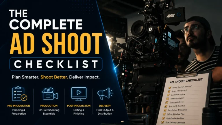

Table of Contents
Lighting References for Premium Product Ads: Lighting Is the First Thing Viewers Feel and the Last Thing They Can Explain
Ask someone why a luxury ad looked expensive, and they will usually struggle to answer.
They might say the colour grade was beautiful. They might say the product looked premium. They might point to the casting or the music. Very rarely will they say the lighting, even though lighting is almost always the primary reason the image felt the way it did.
This is what makes lighting knowledge so valuable for anyone directing or producing premium product ads. The viewer never consciously processes how a scene is lit. They just feel the result. That feeling, whether it reads as luxury, warmth, tension, sensuality, precision, or aspiration, is something the gaffer and the DOP are building frame by frame before the camera rolls.
Flat lighting does not feel like anything. It reads as competent and unambiguous, which is exactly right for a product page or a compliance document. For a premium product ad, flat lighting is a missed opportunity. It leaves emotional money on the table.
The techniques in this guide are the ones that earn that money back.
Each section covers a specific lighting approach, the emotional register it creates, the technical setup behind it, which product categories it works best for, and what it looks like in the context of real ad film production.
The Foundational Principle: Gradations Are What Premium Looks Like
Lighting References for Premium Product Ads: Before getting into individual techniques, one idea that changes how you look at every lighting setup.
Premium perception is not about brightness. It is about gradation.
Amateur product photography tends toward flat, even illumination, where every surface receives equal light. Professional premium photography does the opposite. It creates gradations, smooth and subtle transitions from light to shadow that communicate dimensionality, quality, and craftsmanship.
These gradations are what separate luxury items from mass market photography. Dimensional depth from flat lighting makes products look two-dimensional. Gradations give the same product weight, texture, and significance.
Also Read: 15 Product Shot Angles Every D2C Ad Film Needs
The practical implication is this: when you are setting up a lighting rig for a premium product ad, the question is not “is the product well lit?” The question is “what story are the shadows telling?” If the answer is “no story,” the lighting is not doing its job yet.
1. Rembrandt Lighting: The Definitive Premium Talent Setup
Named after the 17th-century Dutch painter who often worked with subjects illuminated by high windows, Rembrandt lighting is one of the most iconic lighting setups in portrait and advertising photography.
The signature is a small triangle of light on the cheek opposite the main light source, just below the eye. This triangle is a visual cue that the key light is placed far enough to create shape, but not so far that the opposite side of the face falls into deep shadow.
Rembrandt lighting adds structure and seriousness, which works well for editorial headshots and branding that aims to feel thoughtful and intentional. It creates structure through defined cheekbones, jawline, and nose definition without looking over-edited. It controls attention because the bright side becomes the hero and the shadows stop the frame from looking flat.
Technical Setup:
Place the key light at approximately 45 degrees to the side of the subject and roughly 45 degrees above eye level, pointing down toward the far cheek. The light should be positioned so the nose shadow connects with the cheek shadow, forming the triangle of light under the eye on the shadowed side.
The triangle should be no wider than the subject’s eye and no longer than their nose. Position your subject 4 to 8 feet from the background for separation. Add a reflector on the opposite side if the shadows are too heavy for the brand’s tone. Add a rim light only if separation from the background is needed.
The eye on the shadow side must retain a catchlight. Without it, the shadowed side of the face feels dead rather than dramatic.
What lighting ratio to use: For premium talent-forward advertising, a 3:1 ratio (key side three stops brighter than fill side) is the commercial sweet spot. It creates visible shadow without feeling harsh. For high-drama work, move toward 4:1 or 5:1 and let the fill open up only what is needed.
Best light modifier: A medium softbox placed at height creates a controlled, clean triangle. If you want a more painterly quality, a bare bulb or a small hard source gives crisper shadow edges closer to what Rembrandt himself was achieving.
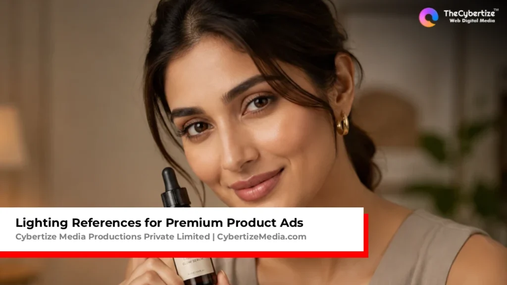
Brand categories this serves: Luxury fashion, premium FMCG, high-end automotive, jewellery featuring a wearer, premium skincare talent close-ups, financial services or investment brand advertising where gravitas is the communication goal.
What to avoid: Do not use Rembrandt on subjects with very round or flat facial structures, as it can accentuate the lack of contour. For corporate work that needs warmth and approachability, Rembrandt adds weight that can feel oppressive. Butterfly or loop lighting is the better choice there.
2. Butterfly Lighting: The Beauty Standard for Skincare and Cosmetics
Butterfly lighting, sometimes called Paramount lighting after the Hollywood studio that used it extensively for their leading actresses in the 1930s and 40s, places the key light directly in front of and above the subject.
The result is a small butterfly-shaped shadow directly beneath the nose and even illumination across the face that emphasises cheekbones, defines facial structure, and reduces unflattering shadows under the eyes and chin.
Butterfly lighting creates a very flattering, symmetrical light that works best when bone structure is already strong and well defined on the subject. If the goal is clean commercial beauty, butterfly lighting is usually the stronger choice over Rembrandt.
Technical Setup:
Position a single large light source, typically a beauty dish or large softbox, directly in front of the subject and raise it high enough so it angles down at about 45 degrees. The key indicator is the shadow under the nose: it should be small and centred, shaped like wings, and must not extend down to the upper lip.
Add a reflector directly beneath the subject’s face to bounce light back upward. This fills in the shadows that a steep overhead angle creates under the chin and in the eye sockets, creating the clamshell variation that is standard for beauty advertising.
The clamshell setup, which is butterfly lighting from above plus a reflector or second light from below, creates a soft, glowing effect with minimal shadow that has been the industry standard for beauty close-ups for decades. Set up the main light in butterfly position above and in front of the subject. Add a second light or reflector just below the face, angled slightly upward. This creates a soft glowing effect with minimal shadow.
Also Read: Digital Ad vs TV Commercial, What’s Actually Different and Why It Matters in 2026
What lighting ratio to use: For beauty advertising, keep the ratio at 2:1 or softer. The point of butterfly lighting is flattery and polish, not drama. Heavy shadow is the enemy here.
Best light modifier: A large beauty dish is the classic choice because its specific light quality is slightly harder than a softbox but wraps more evenly. A large octabox works well for very soft, editorial beauty work.
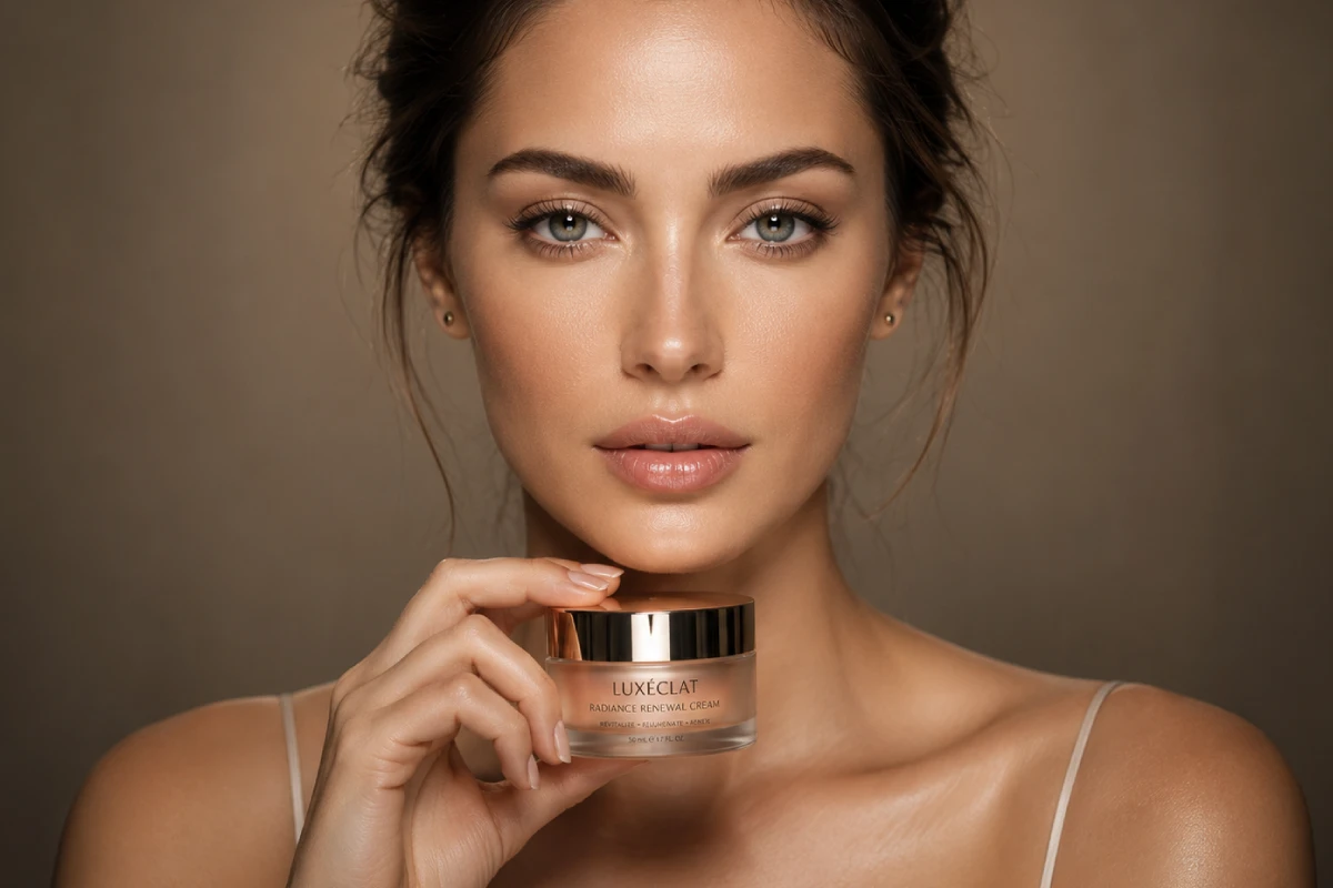
Brand categories this serves: Skincare, cosmetics, haircare, premium wellness brands with talent close-ups, luxury fragrance talent shots, fashion and jewellery with a beauty-forward aesthetic.
3. Split Lighting: When the Brand Wants to Make a Statement
Split lighting divides the face or subject precisely in half, with one side fully illuminated and the other side falling into deep shadow. The line of division runs vertically down the centre of the subject.
Split lighting divides the face exactly in half, with light hitting only one side. It is a dramatic look that has a strong association with sports photography and cinematic portrayals. It conveys power and mystery.
For product advertising, this approach translates directly. A fragrance bottle lit with split lighting immediately reads as mysterious, confident, and aspirational. A tech product shot with split lighting suggests duality, innovation, and power. The shadow is not a problem to solve. It is the point.
Technical Setup:
Position the light source to one side of the subject at approximately 90 degrees from the camera, at a height slightly above the product or subject’s midline. The light should hit only one half of the subject and fall away entirely on the other side.
A single hard light source works best for maximum drama. No fill. No reflector. Let the shadow be complete. If a slight fill is needed to retain some detail in the shadow side, a distant reflector placed very far from the light source can open the shadows minimally without destroying the effect.
What lighting ratio to use: 8:1 or higher. Split lighting is about commitment to contrast. A soft split is a contradiction in terms.
Best light modifier: A bare bulb, a Fresnel, or a small hard source. Soft modifiers spread the light too much and prevent the clean vertical divide that makes split lighting read correctly.
Brand categories this serves: Men’s fragrance and grooming. Sports and performance brands. Tech and consumer electronics. Challenger brands wanting to communicate disruption. Dark and moody aesthetic campaigns.
What to avoid: Split lighting on food products or anything that needs to look appetising or approachable. The drama works against accessibility.
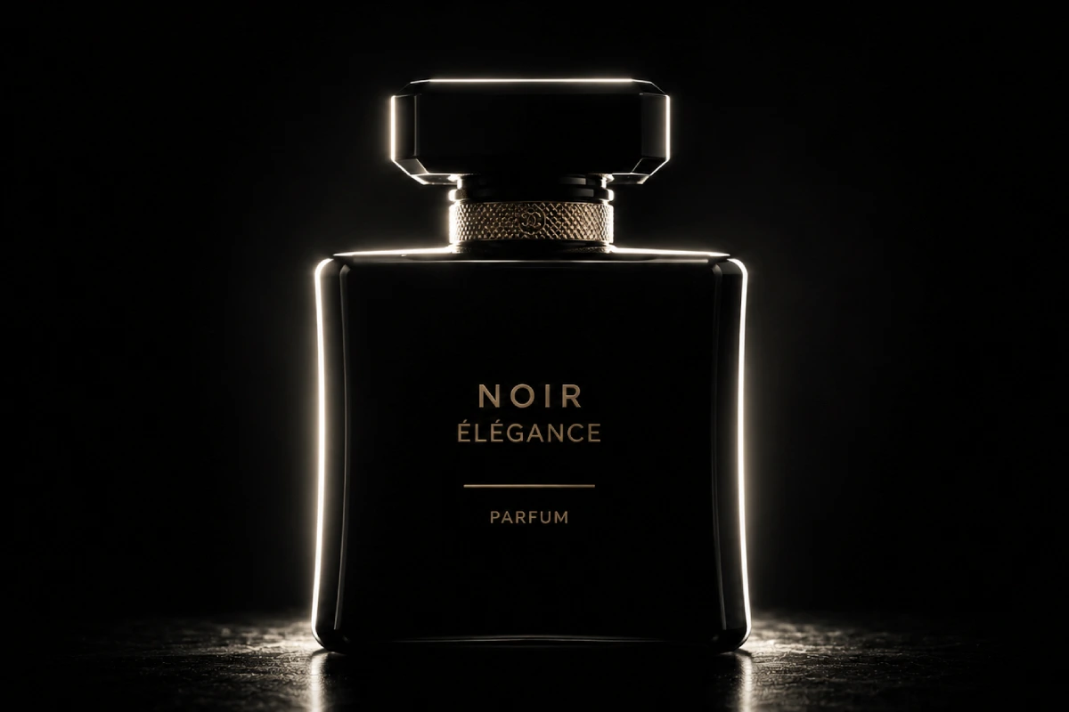
4. Backlighting: The Technique Behind Every Great Transparent Product Shot
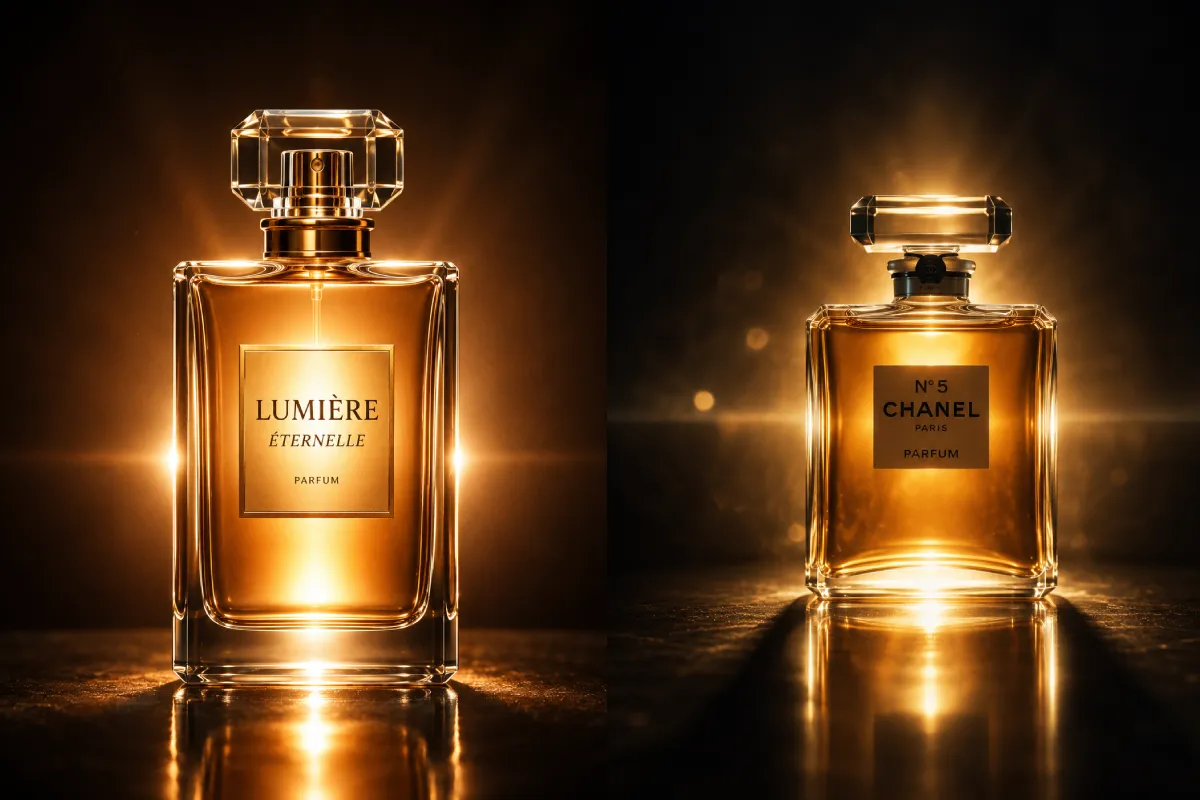
Lighting References for Premium Product Ads: Backlighting is exactly what it sounds like. The primary light source is positioned behind the subject, facing the camera. The subject is illuminated from behind, creating a rim of light around the edges and, for transparent objects, an internal glow.
Transparent products, including perfume bottles, glassware, beverages, and any product with significant translucent components, require a completely different strategy focused on edge definition and internal glow. A perfume advertisement might use backlighting to create a halo effect around the bottle, suggesting an ethereal, almost heavenly quality of the fragrance.
Lighting References for Premium Product Ads: This is not metaphorical. The internal glow that backlighting creates in a glass perfume bottle is genuinely beautiful in a way that no amount of front lighting can replicate. The light travels through the glass, refracts, and emerges with an luminous quality that immediately reads as luxurious.
Technical Setup:
Position the key light source behind the product, between the product and the background. For a transparent object, the light should be positioned to pass through the product and toward the camera lens.
A bright backlight plus edge lighting from two sides is the professional approach for transparent products. The core challenge is that transparent objects disappear against backgrounds without proper lighting. They need light both through them and around them.
Use multiple backlights at different intensities to create a light gradient through a transparent object, adding visual interest and dimensionality. For beverages with colour, backlighting causes the liquid to glow with its true colour in a way that makes it look genuinely desirable.
Managing lens flare: A controlled amount of flare from a backlit setup can look intentional and cinematic. Uncontrolled flare will wash out the product detail. Use a matte box or flag the light carefully to prevent flare from hitting the lens directly unless the creative intention is to use it.
What lighting ratio to use: Backlighting is typically combined with gentle front fill at a 4:1 or 5:1 ratio. The backlight is the key creative element. The front fill merely ensures the product retains some detail on the camera-facing side.
Brand categories this serves: Fragrance and perfume. Premium spirits and beverages. Luxury glassware. Any product with beautiful transparent or translucent packaging. Skincare serums with interesting liquid colour or texture.
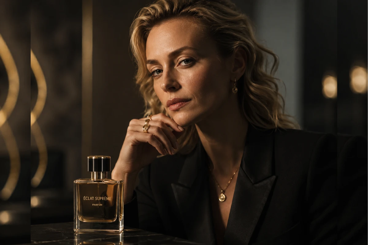
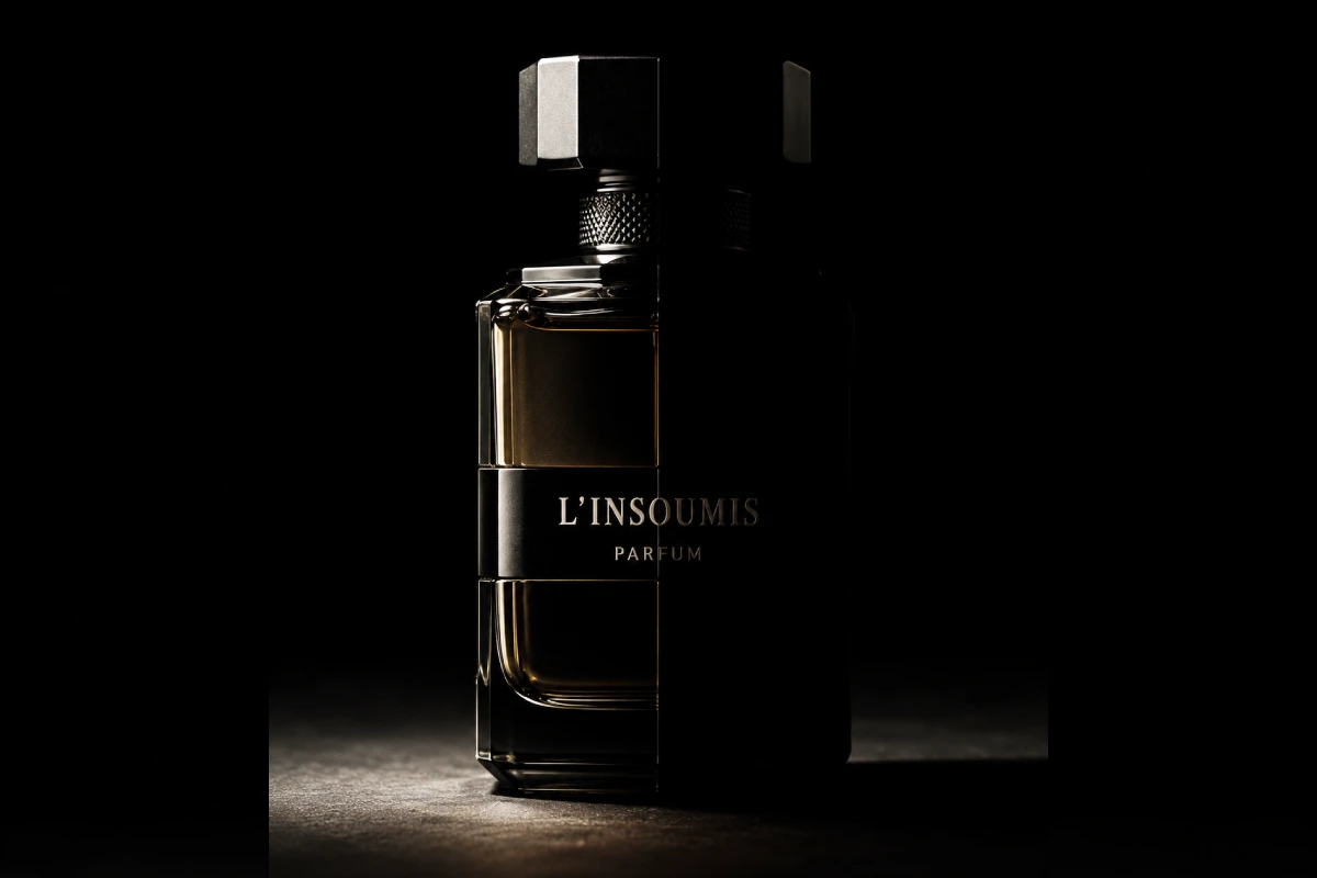
5. Low-Key Lighting: The Language of Luxury and Restraint
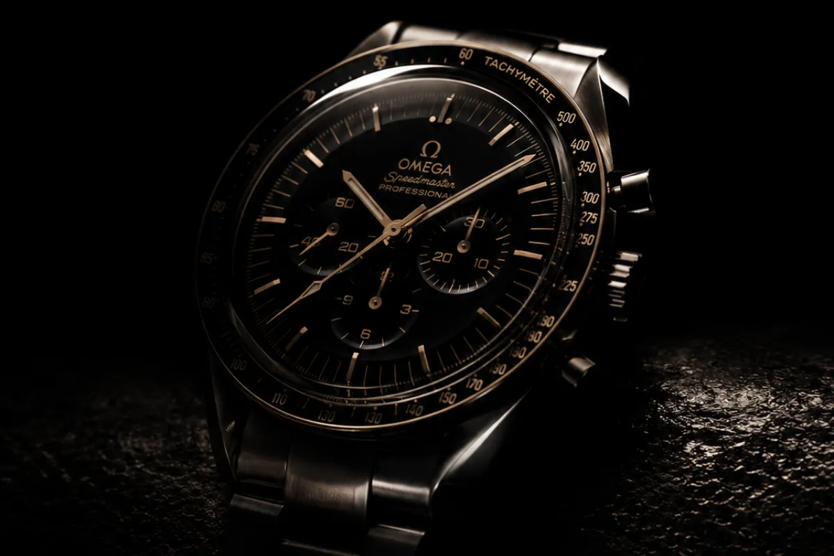
Low-key lighting is a setup in which the overall light level is intentionally reduced, creating an image where the subject emerges from shadow rather than being presented against a light background. The contrast ratio is high. The highlights are precise. The shadows are deep and deliberate.
A luxury watch ad might employ low-key lighting to focus the viewer’s attention on the watch itself, making it stand out against a dark background, creating a sense of mystery and allure.
Low-key lighting for premium products is not about drama for its own sake. It is about directing the viewer’s attention with complete precision. When the background is dark and the product is specifically lit, there is nowhere else for the eye to go. The product becomes the only thing in the frame that matters. That kind of visual authority is something high-end brands spend considerable resources trying to communicate.
Technical Setup:
Start with a completely dark environment. No ambient light. No fill from walls or ceiling. Then add light back precisely where it is needed and nowhere else.
A single spot or Fresnel aimed at the product, with everything else blacked out using flags and negative fill (black cards that actively absorb ambient light), creates the cleanest version of this look.
Lighting References for Premium Product Ads: For luxury watch photography, the bare bulb behind an acrylic diffusion panel is very crucial and very time-consuming, but it creates the characteristic gradations on the watch dial that separate premium from amateur photography.
Foreground and background separation: With low-key lighting, the product sits against deep shadow. The tonal separation between the product’s lit surfaces and the dark background is essentially doing the work of a matte. The product feels like it is floating in darkness, which is one of the most powerful compositional devices in premium product advertising.
Also Read: Animation Cost Per Minute in India
What lighting ratio to use: The concept of ratio changes in low-key work. Rather than managing key-to-fill ratio, the primary control is the precision and quality of the single key source, and the discipline of removing all other light.
Best light modifier: For watches and jewellery, bare bulb behind diffusion. For larger products, a small softbox or snoot to control spill. Fresnel lenses for precise beam control on hero product frames.
Brand categories this serves: Luxury watches and timepieces. Fine jewellery. Premium spirits. High-end automotive. Men’s fragrance. Technology with premium industrial design. Any product where the brand positioning is “rare” or “exclusive.”
6. High-Key Lighting: The Signal of Confidence and Cleanliness
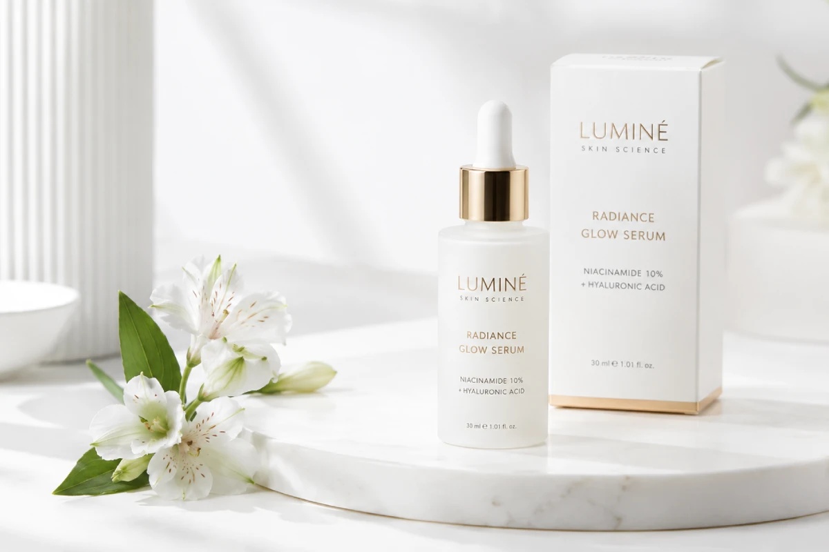
The opposite of low-key. High-key lighting floods the scene with even, bright light, reducing shadows to a minimum and creating a clean, open, accessible visual environment.
High-key lighting is not simple or amateur, despite what some productions assume. Perfectly flat high-key lighting is technically demanding because any inconsistency in the light, any hotspot, any uneven shadow on a white or neutral background, becomes immediately visible. The absence of shadow reveals every flaw in the setup.
Done correctly, high-key lighting communicates confidence. The brand has nothing to hide. The product is so good it does not need dramatic lighting to make it interesting.
Technical Setup:
Lighting References for Premium Product Ads: Two large light sources on either side of the subject at a 45-degree angle, plus a background light that brings the background up to two stops brighter than the subject. The subject light ratio should be close to 1:1 between the two sides, with gentle gradations rather than flat illumination.
A top light or beauty dish from above adds slight definition and prevents the product from looking completely flat even within the high-key environment.
The infinity cove: High-key product work is most commonly done on an infinity cove, a studio setup where the floor curves up to meet the wall without a visible seam, creating a seamless white environment. This is what produces the effect of the product appearing on a pure white or seamless grey ground with no visible horizon.
What lighting ratio to use: 1:1 to 1.5:1 on the subject lights. Background light at subject plus one and a half to two stops.
Best light modifier: Large softboxes or strip lights. The goal is maximum diffusion and even spread.
Brand categories this serves: Premium skincare on white. Apple-aesthetic technology products. Premium FMCG on minimal packaging. Clean beauty brands. Pharmaceutical products that need clinical trust.
7. Loop Lighting: The Commercial Workhorse for Talent-Facing Product Ads
Loop lighting is likely the most widely used portrait lighting pattern in commercial advertising. The key light is placed at roughly a 45-degree angle and elevated above the subject’s eye level, producing a small shadow that loops downward from the nose and to the side of the face without connecting to the cheek shadow.
Just like Rembrandt lighting, loop lighting is a flattering style of light that works well on virtually any subject, regardless of whether they are male or female. It also works for products so that it is not flat light and does throw light to create some light and shade, which gives contrast to the product.
The catchlight, ideally sitting at the 10 o’clock or 2 o’clock position in the eye, is something to check before every frame in a loop lighting setup.
Technical Setup:
Place the key light at 45 degrees to the side and slightly above the subject’s eye level. The difference from Rembrandt is that the shadow from the nose does not connect to the cheek shadow, leaving the far side of the face brighter. Add fill from the opposite side at a 3:1 ratio for most commercial work. The result is flattering, natural-feeling, and appropriate for a very wide range of brand personalities.
Why loop for commercial talent work: Loop lighting is what most viewers have been trained to read as “good light on a person” because it is what the majority of well-produced television content, film production, and commercial photography uses as a standard. It does not announce itself. It reads as natural while being completely controlled.
Also Read: How Much Does a Corporate Video Cost in 2026?
Brand categories this serves: Any campaign involving talent where the brief is to look good and trustworthy rather than dramatic. FMCG campaigns, family-oriented brands, health and wellness brands with a warm tone, banking and financial products where human connection is the communication priority.
8. Rim Lighting and Edge Lighting: The Shape Revealer
Rim lighting places a light source behind the subject, positioned slightly to one side, creating a bright outline along the subject’s edges. It separates the subject from the background by drawing a line of light around the form.
In product advertising, rim lighting is one of the primary tools for revealing three-dimensional shape and material quality. A rim light on a dark product against a dark background is often the only thing that makes the product’s silhouette legible. Without it, the product disappears into the background. With it, the product’s edges glow and its form becomes immediately clear.
Technical Setup:
Place the rim light behind the subject and slightly to one side, aimed at the camera but flagged so the direct light does not enter the lens. The angle is typically between 120 and 150 degrees from the camera position. The intensity should be one to two stops brighter than the key light to create a visible, clean rim.
Lighting References for Premium Product Ads: A second rim light on the opposite side creates a double rim effect that gives the product a defined silhouette from both sides. This two-rim setup is standard for premium automotive product films, watches, and any product where the physical form is a central design value.
Specular highlights: For metallic or reflective products, the rim light also creates specular highlights, sharp, bright reflections on the surface that communicate material quality. Bare stainless steel with controlled specular highlights reads as precision engineering. The same metal with flat, diffuse lighting reads as ordinary.
Brand categories this serves: Automotive and motorcycle. Luxury watches and precision instruments. Consumer electronics and tech accessories. Premium audio equipment. Any product where the physical form and material construction is part of the brand’s value proposition.
9. Practical Lighting: Using the Environment as the Source
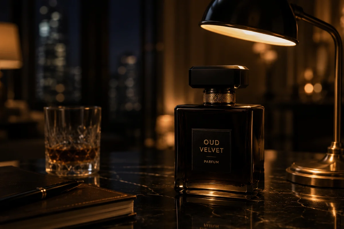
Practical lighting uses light sources that are visible within the frame, lamps, candles, windows, screens, city lights, and treats them as the primary light source for the scene. The light is motivated by the environment rather than by an invisible off-screen source.
In premium product advertising, practical lighting is the technique behind campaigns that feel genuinely cinematic rather than like a product shoot. When a glass of whiskey is lit by the warm light of a fire visible in the background, the warmth of that light connects the product to the emotional territory of comfort, tradition, and indulgence in a way that a studio setup can approximate but rarely matches.
Technical Setup:
Practical lighting is more complex to control than conventional studio lighting because the light sources are visible and must look realistic while also providing usable illumination for the product. This typically involves:
Replacing standard bulbs in visible practical lights with higher-intensity versions to provide enough light for the product. Adding concealed additional sources, small LED panels, Kino Flos, or bounce cards hidden behind furniture or off-frame, that support the practical source without being visible. Using the colour temperature of the practical source as the guide for the entire colour treatment of the scene.
What lighting ratio to use: Practicals typically work best with a high contrast ratio that reflects real-world light falloff. 5:1 to 8:1 is common in practical-heavy setups.
Brand categories this serves: Premium spirits and whiskey. Luxury lifestyle brands with heritage positioning. Home goods and interiors. High-end hospitality and hotel campaigns. Seasonal campaigns where warmth and occasion are the emotional territory.
10. Raking Light: For Surface, Texture, and Material
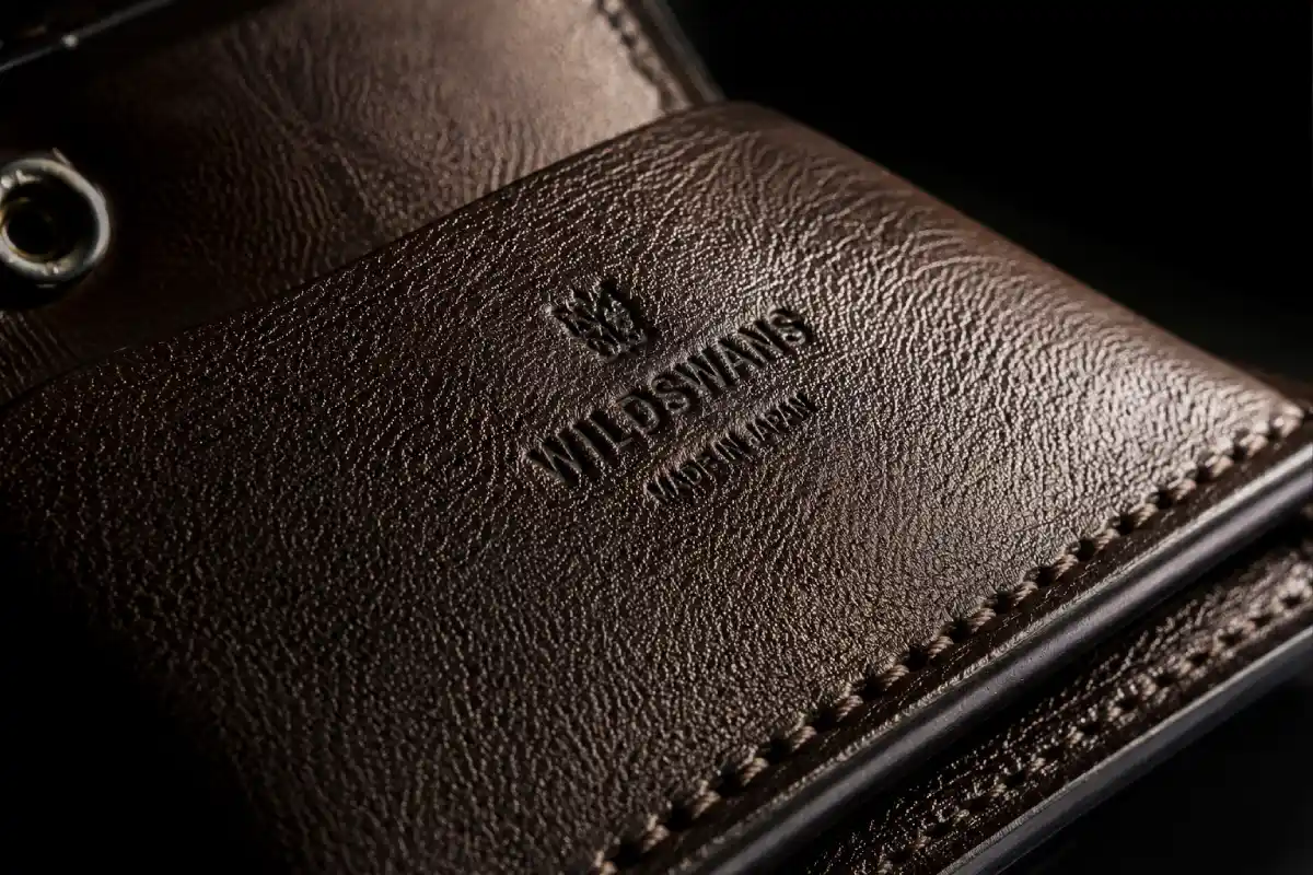
Raking light, sometimes called grazing light, is placed at a very low angle relative to the surface being photographed, almost parallel to it. Instead of illuminating the surface evenly, the light grazes across it, creating pronounced shadows in any surface irregularity, revealing texture at a level that frontal or overhead light cannot.
When photographing a product where the texture of the material is part of the value proposition, raking light is the technique that makes that texture legible. A handwoven textile. An embossed leather good. A cold-pressed bar of soap. The grain of a wooden product. The etching on a premium glass bottle. None of these textures read under flat or frontal lighting. All of them become the focus of the image under raking light.
Technical Setup:
Place a hard light source at an extreme angle to the surface, typically 5 to 15 degrees from horizontal. The light should just barely skim the surface. Small LED panels, bare tungsten sources, or snoot-restricted strobes work well because they produce a hard, directional beam.
The subject should be positioned on a stable surface and the camera positioned directly above or in front, with the light source running nearly parallel to the surface from the side or from just in front. Even tiny surface variations, invisible under normal lighting, become visible topography under raking light.
What lighting ratio to use: No fill. This is a technique that requires total commitment to the shadow. Fill light destroys the texture reading. If the shadows are too deep for the creative intent, the solution is to move the light slightly further from the surface, not to add fill.
Brand categories this serves: Luxury packaging and premium printed materials. Artisan food products. Skincare that references natural ingredients and texture. Handmade goods. Luxury stationery. Any product where craftsmanship and materiality are the value.
11. Colour-Temperature Contrast: Warm and Cool Simultaneously
This is a technique rather than a named lighting setup, but it is one of the most powerful tools in premium product advertising and one of the most underused in standard commercial work.
Colour-temperature contrast uses two light sources of different colour temperatures in the same frame, typically a warm source (tungsten, candlelight, warm LED) on one side and a cool source (daylight, blue-gelled strobe) on the other. The result is a product that exists within a colour-divided world, with one side reading warm and the other reading cool.
This technique is used extensively in premium automotive campaigns, luxury watch advertising, and high-end fragrance work. The Chanel No. 5 visual vocabulary of golden warmth against cool blue-white is a colour-temperature contrast technique. The warm side says heritage, warmth, and desire. The cool side says modernity, precision, and aspiration.
Technical Setup:
Two light sources, one with a warm gel (CTO) and one with a cool gel (CTB), placed at roughly 90 degrees to each other relative to the product. The product sits at the intersection of the two colour zones.
The colour transition across the product should be gradual rather than a hard line. If the transition looks mechanical, soften the edges with diffusion or by moving one light further from the product.
Brand categories this serves: Premium automotive. Luxury watches. High-end fragrance. Technology products with both performance and design positioning. Premium spirits.
12. Lightbox and Diffused Tent Lighting: The Jewellery and Watch Standard
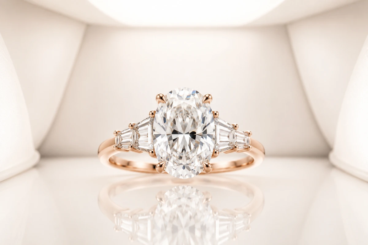
When a product is highly reflective, the choice of what light source to use is overridden by a more important choice: what do you want the product to reflect?
A polished metal watch dial does not show the light you put on it. It shows you a mirror image of the studio around it. And unless you have built an environment specifically designed to look good when reflected in a polished metal surface, the product will reflect camera equipment, lights, ceiling tiles, and the photographer’s torso.
A lightbox or diffusion tent is a completely enclosed, seamlessly lit environment built around the product specifically so that all the product reflects is an even, gradated, perfectly clean white or grey environment.
Jewellery photography demands simultaneous achievement of multiple goals: sparkle from gemstones, form definition through metal gradations, and colour accuracy in the gemstone hues. A polarising filter combined with a diffusion tent setup is essential for polished pieces, reducing unwanted reflections while enhancing colour saturation.
Technical Setup:
Build a seamless diffusion tent from large panels of translucent material, typically ripstop nylon or diffusion silk, on all sides and above the product. Light the outside of the tent with multiple sources from different angles. The inside of the tent is now a seamlessly lit environment that the product reflects as a smooth gradation.
Leave openings for the camera lens and use a black card around the lens to prevent the camera itself from appearing as a reflection.
For watches specifically, the bare bulb behind an acrylic diffusion panel is a standard technique. The size and position of the acrylic panel controls the gradation on the watch dial and crystal, and this is genuinely time-consuming work to get right.
Brand categories this serves: Fine jewellery and watches. Premium cosmetics and fragrances in reflective packaging. Consumer electronics with polished surfaces. Luxury accessories in leather or metal.
Putting It All Together: Lighting Reference as Creative Direction
A lighting reference image is one of the most useful tools a director can bring to a pre-production creative meeting.
Where a script describes what happens and a storyboard describes what is framed, a lighting reference communicates something that neither of those documents can: how the final image is meant to feel. The specific quality of shadow. The colour temperature of the scene. Whether the product emerges from darkness or stands in clean open light.
Most effective premium product ad briefs have at least three to five lighting reference images that the director and DOP review together before the shoot. These are not necessarily other ads. They can be paintings, film stills, architectural photographs, or fashion editorials. What matters is that they communicate the emotional register that the lighting is meant to achieve.
Rembrandt paintings for the quality of shadow on a talent-forward campaign. Kubrick stills for clinical precision in a tech product film. Caravaggio’s chiaroscuro for maximum drama in a luxury launch campaign. Norman Parkinson’s fashion work for the quality of natural light in a lifestyle brand film.
The best lighting references are not technical documents. They are emotional arguments. They say: this is the world we are building, and this is how we want the viewer to feel when they are inside it.
The Production Checklist for a Premium Product Lighting Setup
Lighting References for Premium Product Ads: Before the camera rolls on any premium product ad film shoot, the gaffer and DOP should be able to answer these questions:
What is the primary emotion this shot is meant to create, and is the current lighting setup creating it?
Where are the shadows falling, and is every shadow intentional?
What is the product reflecting, and does that reflection serve or undermine the image?
What is the key to fill ratio, and does it match the brand’s personality?
Is there a practical or ambient light element in the frame, and is it motivated by the environment?
What does this setup look like on the specific product category being filmed? A lighting rig that makes a glass perfume bottle glow will flatten a matte skincare packaging. The setup has to be built for the specific visual properties of the product, not for a general sense of “good lighting.”
Final Word from Cybertize Media Productions
Light is the most powerful creative tool on any film set. More powerful than the camera. More powerful than the lens. More powerful, in some ways, than the script, because it communicates directly to the viewer’s emotional brain before a single word has been understood.
The lighting setups in this guide are not formulas. They are starting points. A director and DOP who understand what Rembrandt lighting communicates and why can make an informed decision to use it, modify it, or reject it in favour of something the specific brief requires.
Great lighting for premium product ads does not look like lighting at all. It looks like the product deserved to be filmed that way.
At Cybertize Media Productions Private Limited, our DOP and gaffer conversations happen early in pre-production, long before the cameras are booked and the studio is hired. Because by the time the first light is turned on, the emotional register of the film should already be decided.
Cybertize Media Productions Private Limited is a full-service ad film and corporate video production company working with brands across India.