Table of Contents
Explainer Video Production: There is a specific kind of disappointment that happens about three weeks after an explainer video goes live. The team watched it on delivery day and thought it looked great. The client approved it. The motion graphics were smooth, the colour palette was on brand, and the voiceover artist had a warm, confident delivery. It went up on the homepage. It got shared in the newsletter. And then, nothing changed. The metrics looked the same. The conversion rate did not move. Nobody mentioned the video in a sales call.
This happens constantly, across every kind of business and every budget level, and the creative team almost never knows why because the animation genuinely does look good.
Looking for Explainer Video Production Agency Near you? We’re here to help.
The problem is not the animation. The problem is what was decided before the animation studio opened a single file: who this video is for, what it is supposed to make them feel, what one thing it needs them to understand, and what it needs them to do when it ends. Get those decisions wrong, and no amount of smooth motion and polished colour grading will save the video from irrelevance.
This piece is about all the ways explainer videos fail that have nothing to do with how they look.
The Market Reality: Explainer Videos Work, Just Not the Ones You Are Probably Making
Start with the data that makes this topic worth taking seriously.
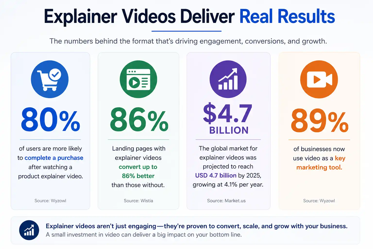
80% of users are more likely to complete a purchase after watching a product explainer video. Landing pages with explainer videos convert up to 86% better than those without. The global market for explainer videos was projected to reach USD 4.7 billion by 2025, growing at 4.1% per year. 89% of businesses now use video as a key marketing tool.
These are strong numbers. They describe a format that, when it works, works measurably and significantly. Explainer videos are not a soft brand awareness play. They are a conversion tool with documented, quantifiable impact on purchase decisions.
So why are so many of them sitting unwatched?
The five core areas that frequently undermine animated video performance are weak scripting, inconsistent visuals, substandard audio, ineffective calls-to-action, and limited distribution strategies. Four of those five have nothing to do with the quality of the animation. And the fifth, visual consistency, is a brand strategy problem disguised as a production problem.
The gap between “what explainer videos can do” and “what most explainer videos actually do” is almost entirely a strategic and scripting gap. The production industry has largely solved the visual problem. It has not solved the thinking problem.
Failure Point One: The Script Was Written by Someone Who Already Understands the Product

This is the most common reason explainer videos fail, and it is the hardest to diagnose because it is invisible inside the organisation that made the mistake.
When you have spent months building something, you live in it. You know the context, the edge cases, the workarounds, and how it all fits together. Everything makes sense in your head. But a stranger seeing it for the first time is confused.
Founders and product managers write explainer video scripts the way they explain their product in a pitch meeting, with months of assumed context, excitement about technical differentiators that only matter if you already understand the category, and a structural instinct to cover everything rather than choose one thing to say clearly.
Scripts where the founder wastes thirty seconds on a problem nobody asked about, then spends the next thirty describing features that only make sense if you already know the product, are backwards. The viewer does not have your context. They have three seconds of patience and one question: does this solve something I actually care about?
The fix is not hiring a better writer. It is asking the right question before any script is written: what is the single most common problem the target customer had before they found this product? Not two problems. Not the five-feature list. One. The script that answers that question for a specific person in plain language consistently outperforms the script that tries to explain everything to everyone.
Failure Point Two: The Video Is Trying to Serve Too Many Audiences
“This is for anyone who needs to manage projects” is not an audience. That is a crowd. A good explainer speaks to a specific person with a specific problem.
The pressure to make an explainer video work for every possible viewer comes from every direction inside a business. Sales wants the enterprise angle. Marketing wants the SMB angle. The product team wants all the features shown. The founder wants the vision communicated. The result is a script that tries to speak to everyone and ends up resonating with no one, because resonance requires the viewer to recognise themselves in what they are watching.
A viewer who sees themselves in the first ten seconds of an explainer video does not leave. A viewer who is watching a generic description of a problem that sort of applies to them but is not quite their situation does.
Also Read: Why Premium Brands Invest Heavily in Sound Design
The businesses that use explainer videos most effectively almost always have a separate video for each major audience segment rather than a single video trying to serve all of them. An enterprise IT buyer and an SME owner both need the same product explained to them differently, with different problems surfaced, different vocabulary used, and different emotional triggers activated. One video cannot do that work for both of them without compromising the clarity that makes the video effective for either.
Failure Point Three: The Hook Is Wasted on a Branded Intro
71% of viewers decide within the opening moments whether a video is worth their time. Most explainer videos waste those seconds on a branded intro animation or a generic welcome.
The animated logo sting at the opening of an explainer video is the single most consistent self-defeating decision in the category. The viewer has given the video three seconds of attention. The video spends those three seconds showing them the company name and logo animation, which they either already know because they are on your website, or do not yet care about because you have not yet given them a reason to.
The opening line should mirror something the viewer already feels. A problem they are dealing with. A question they have been asking. A result they want. When viewers hear themselves in a video, they keep watching.
The branded intro does not make the viewer feel anything except mildly impatient. And three seconds into a video, mildly impatient is enough to scroll.
The most effective opening for an explainer video is a problem statement so specific and accurate that the viewer’s immediate internal response is “yes, exactly.” That response locks in their attention better than any amount of smooth logo animation or cheerful opening music.
Failure Point Four: The Script Has No Structure
A good script has backbone: problem, insight about why the problem exists, the solution, the result. Without structure, scripts wander. With structure, they work.
Most explainer video scripts that fail do so not because they lack information but because they lack sequence. The information is there. The product does solve a real problem. But the script moves from feature to feature without a logical throughline that the viewer can follow, and without a clear emotional arc that takes them from “I recognise this problem” through “this is why it’s hard to solve” to “this specific thing solves it” to “here’s what my life looks like when it’s solved.”
That arc is not a stylistic preference. It mirrors how human decision-making actually works. People do not buy products because they understand features. They buy products because they can picture themselves in a better situation. A script that does not take the viewer from their current pain point to a specific, desirable outcome has not completed the persuasion job the video exists to do.
The four-part structure that consistently works for explainer videos:
The problem. State the specific, named frustration the target viewer experiences. Not a category of problem but a precise moment of pain: “Every time you send a client a PDF proposal, you have no idea if they opened it, shared it with anyone, or just ignored it.”
Why it’s hard. A single insight about why this problem has persisted. This validates the viewer’s experience and builds credibility: “Most proposal tools track open rates, not actual engagement, so you’re flying blind.”
The solution. How the product resolves that specific problem. One clear mechanism, not a feature list: “This shows you exactly which pages each viewer spent time on, in real time.”
The outcome. What the viewer’s situation looks like after the problem is solved: “So your next follow-up call is about the clause they spent four minutes on, not a cold check-in.”
Every sentence in a working explainer video script is doing one of those four jobs. Every sentence that is doing none of them is a sentence that is losing viewer attention.
Failure Point Five: Beautiful Visuals Are Actively Getting in the Way
Animation quality and message clarity are different things. A simple design with a clear message beats a stunning animation with a muddled idea. Always. But the stunning animation is easier to confuse with quality.
This is the uncomfortable truth that production companies rarely say out loud: sometimes the visual ambition of an explainer video works against its clarity. When the animation is visually complex, the viewer’s cognitive attention is split between following the visual and following the message. If the visual is doing something interesting, the message loses.
Explainer videos that use simple, clean visual design, flat characters, minimal background detail, and illustrations that exist only to reinforce the verbal message, consistently retain viewers more effectively than visually dense animations full of movement, particle effects, and kinetic typography that competes with the voiceover for the viewer’s attention.
This does not mean explainer videos should look cheap or minimal. It means the visual design should be in service of the message, not competing with it for cognitive bandwidth. Every animated element should either be reinforcing what the voiceover is saying at that moment or staying out of the way entirely.
The most common visual mistake in failing explainer videos is motion for the sake of motion: elements flying in and out of frame, characters performing actions unrelated to the narration, background animations that create visual noise without adding communicative value. Each of these is a small tax on the viewer’s attention at exactly the moment the message needs their full focus.
Failure Point Six: The Video Is Two Minutes Long When It Should Be Ninety Seconds
Keep videos under 90 seconds for maximum retention. That constraint forces the clarity your audience needs to take action.
Explainer videos routinely run long because the brief they were built from was too broad. When the script tries to cover everything, the video runs three minutes. When the script covers one thing well, the video runs 90 seconds, and 90 seconds is where retention is highest.
There is also a more insidious version of this problem: the video is technically 90 seconds but the actual content takes 60 seconds, with the remaining 30 spent on a branded intro, an outro, and a slower-paced conclusion that recaps what was just explained. Those 30 seconds are not free. They are 33% of the viewer’s attention budget being spent on content that does not advance the persuasion at all.
Length is a symptom, not a cause. An explainer video that is too long is almost always an explainer video with a script that did not answer the question “what do we leave out?” before it answered “what do we include?”
The discipline of cutting is harder than the discipline of adding, and it is the discipline that most explainer video production processes skip. Every brief should include a maximum word count for the script, because word count is the most reliable proxy for video length, and video length is the most reliable proxy for how much of the audience finishes it.
Failure Point Seven: The Call-to-Action Is Vague or Missing
A video without a clear next step is just content. It becomes a conversion tool the moment you add a single, specific task.
The call-to-action in most explainer videos is either absent, generic (“learn more,” “visit our website”), or placed at the end of a video that has already lost the majority of its audience to drop-off before the closing seconds.
An effective CTA in an explainer video has three properties. It is specific: “Start your free 14-day trial” is more effective than “sign up today.” It is low-friction: asking for a credit card in the CTA of a top-of-funnel explainer video is asking for a commitment the viewer has not yet earned. And it appears when viewer engagement is highest, not only at the very end.
Research on video engagement consistently shows that drop-off is highest in the final third of a video. If the CTA only appears in the last five seconds, the majority of viewers who would have acted on it have already left. The most effective placement for a soft CTA, a simple directional prompt rather than a hard conversion ask, is at the peak of the video’s engagement, after the solution has been revealed but before the conclusion.
Failure Point Eight: The Wrong Voice Killed the Right Script
Voiceover quality and casting receive far less attention in the explainer video production process than they deserve, given how much work the voice is doing.
The voiceover in an explainer video is carrying the entire verbal message. The animation illustrates it, but the voice is what the viewer is actually listening to and what their brain is processing for meaning. A script that is written clearly and structured effectively can still underperform if the voiceover delivery is wrong.
The wrong delivery means: a pace that is either too fast (concepts disappear before they land) or too slow (the viewer’s attention outpaces the content). A tone that does not match the brand or the audience (a cheerful, energetic read on a product video for a legal services firm creates an instant credibility mismatch). A read that sounds scripted rather than conversational, because the viewer’s brain is calibrated to trust a conversational voice and distrust a performance.
Substandard audio is one of the five core areas that undermine animated video performance. This includes not just technical audio quality, which most studios get right, but the human qualities of the voiceover delivery that determine whether the viewer trusts the voice they are listening to.
Failure Point Nine: Distribution Was an Afterthought
A significant number of explainer videos fail not because of any production problem but because they were placed incorrectly, on the wrong page, targeting the wrong stage of the buyer journey, or optimised for no platform at all.
Many businesses create a great explainer video but fail to distribute it effectively. Common mistakes include uploading the video without optimising the title, description, or keywords.
An explainer video designed for the homepage is a different animal to an explainer video designed for a mid-funnel landing page after a paid ad click. The homepage viewer is arriving cold and needs the problem-solution arc from scratch. The mid-funnel viewer already has some awareness and needs the differentiation argument made quickly and specifically.
Using the same video in both placements, and expecting it to perform equally well in both, is a common and costly assumption. The average watch time, the appropriate level of assumed familiarity, and the ideal CTA all differ between these two contexts.
The solution is not always making a second video. It is knowing where the video will live before the script is written, and writing toward that specific context rather than toward a generic “potential customer” abstraction.
Explainer Video Production: What a Working Explainer Video Actually Looks Like
All of the above failure points share a common thread: they are problems that originate in the brief and the script stage, not in the animation stage. This is why a production company that receives a weak brief and a wandering script cannot save the video no matter how well they animate it.
A working explainer video starts with a brief that answers four questions before any creative work begins:
Who exactly is this for? Not a demographic. A specific person with a specific problem at a specific stage of awareness about the category.
What is the one thing this person needs to understand to move forward? Not two things. Not five. One.
What does “moving forward” look like? What specific action does the viewer take, and when?
Where does this video live, and what does the viewer know before they arrive at it?
When those four questions are answered clearly, the script almost writes itself. When they are not answered, the script tries to answer them mid-production, which produces the wandering, over-inclusive, visually polished, conversion-empty explainer videos that the industry produces by the thousands every week.
How Cybertize Media Productions Approaches Explainer Video Production in India
At Cybertize Media Productions Private Limited, we have built our explainer video process around a single conviction: the script is the product, and everything else is the delivery mechanism.
Before we design a single character or choose a visual style, we run every explainer video brief through a strategic clarity exercise. Who is the exact viewer? What specific problem are they experiencing? What does the viewer do immediately after watching? What will they remember in three days?
These questions are not rhetorical. They have specific answers, and those answers shape every structural decision in the script before any animation brief is written. The visual style, the character design, the music tone, the voiceover casting: all of these serve a script that already knows what it is doing.
An explainer video that converts is not primarily a design challenge. It is a thinking challenge. The animation just has to not get in the way.
Cybertize Media Productions Private Limited is a full-service video production company based in India, producing explainer videos, ad films, corporate films, and brand storytelling content. Our explainer video process starts with strategic clarity before a single animation frame is designed, because a video that does not know what it is doing cannot be saved by how it looks.